
Reconsidering Onboarding
Perch – 2024
Brief
How might we turn first-time users into engaged readers without forcing them through a rigid signup process—while delivering the personalized experience they expect?
Duration
2 Days
Team
Solo Consultancy
Roles played
Product Designer
TLDR;
Removed content barriers to let users explore freely, prioritized smart personalization through email and social connections, and optimized reading comfort—creating an onboarding that proves value instantly while building a tailored reading experience.
Removed content barriers to let users explore freely, prioritized smart personalization through email and social connections, and optimized reading comfort—creating an onboarding that proves value instantly while building a tailored reading experience.


Overview of final Main Flow Screens

Annotated new main onboarding flow compared to the original
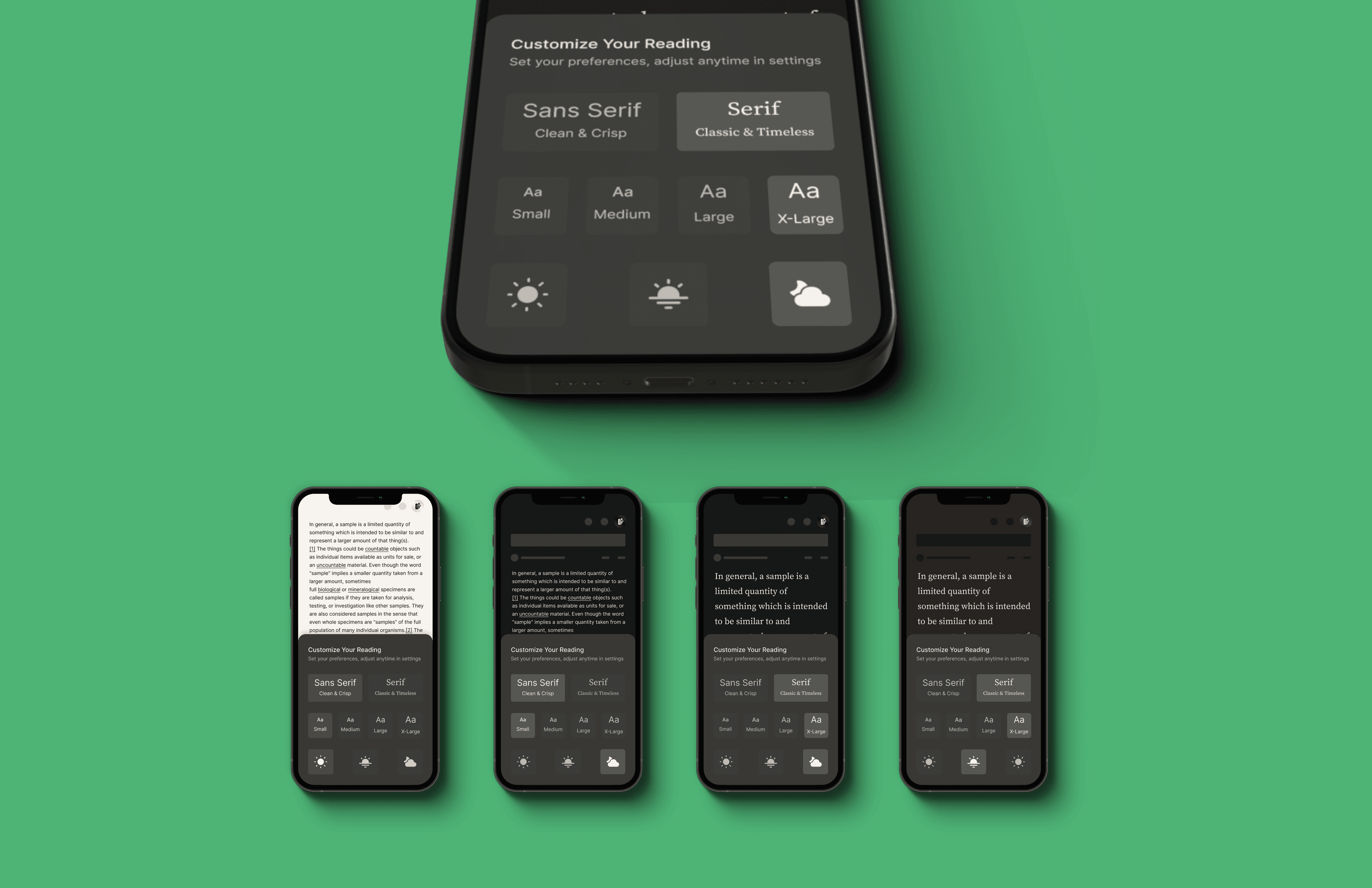
After signing in for the first time and opening the first publication, users are greeted with the ability to personalize their reading settings. The icon in the top corner gets highlighted so users know where to find this setting in the future.
Duration
Duration
Duration
Duration
2 days
Roles played
Roles played
Roles played
Roles played
Product Designer
Product Designer
Product Designer
Team
Team
Team
Team
Solo Consultancy
Brief
Brief
Brief
Brief
How might we turn first-time users into engaged readers without forcing them through a rigid signup process—while delivering the personalized experience they expect?
How might we turn first-time users into engaged readers without forcing them through a rigid signup process—while delivering the personalized experience they expect?
How might we turn first-time users into engaged readers without forcing them through a rigid signup process—while delivering the personalized experience they expect?
How might we turn first-time users into engaged readers without forcing them through a rigid signup process—while delivering the personalized experience they expect?
Intro
Intro
In a world of what feels like infinite content, readers don't just need another app—they need a compelling reason to make reading a daily habit.
Perch brings all your newsletters and online reads into one space and helps you discover new content based on your interests.
I had two days to rethink how users discover and actually engage with content from the start. Given the short time frame, I prioritized changes that would move the needle on retention. Decisions needed to balance what users want, what's technically possible, and what helps the product grow.
Upon reviewing their current flow, three opportunities jumped out: Create value before commitment, frictionless signup, and organic personalization.
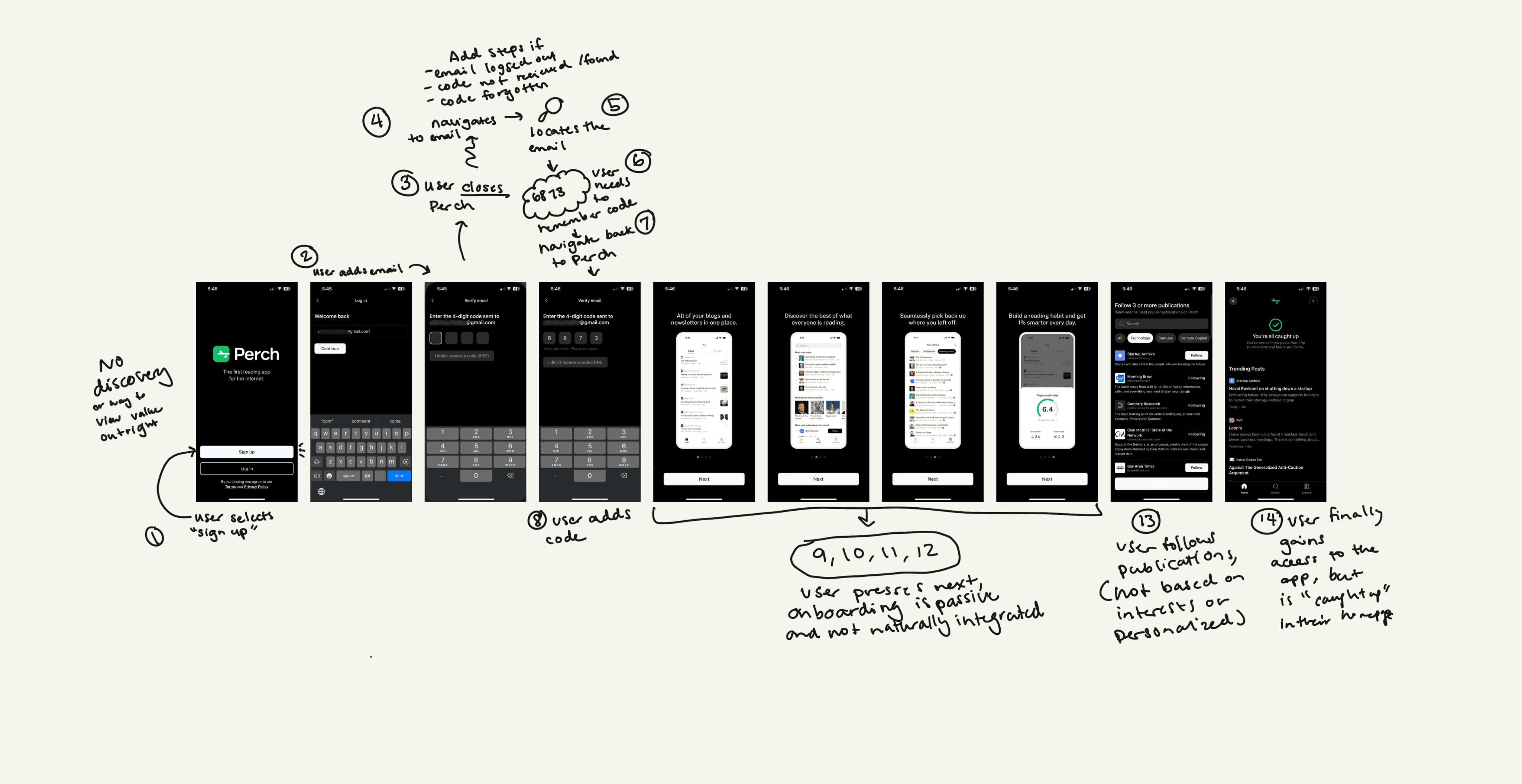
The original annotated user flow
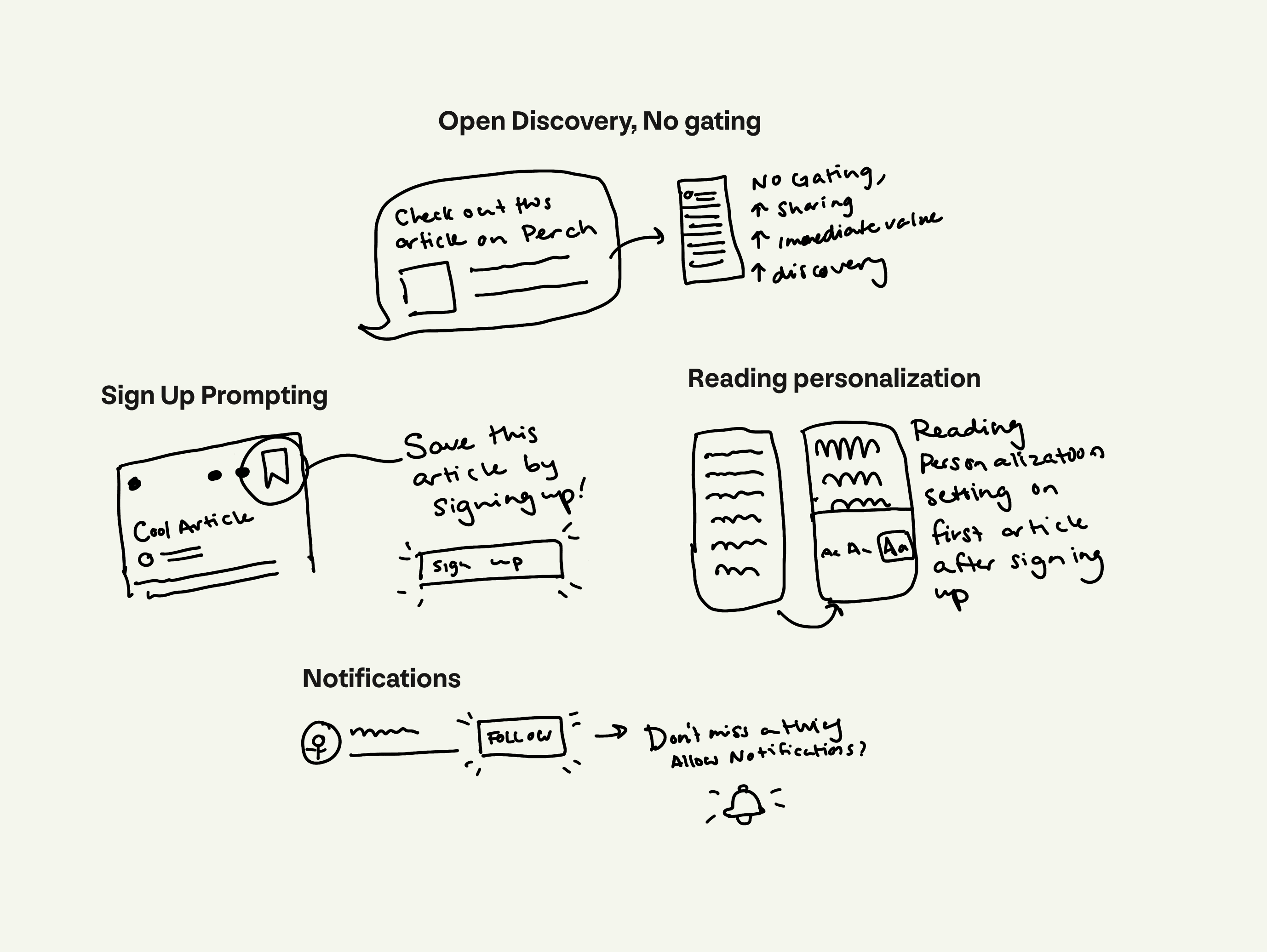
Opening the gates
Opening the gates
Opening the gates
Removing pre-signup content gating
Removing pre-signup content gating
Products typically have just one minute to demonstrate value to first-time users. When content is gated, we ask for commitment before showing what makes Perch worth using.
Letting people explore content before signing up creates natural growth loops. Shareable content leads to organic discovery, while progressive personalization increases the likelihood they'll meaningfully commit to the product, thus increasing retention.
Reimagining Email Verification:
Changing Six Leaps to One Step
Reimagining Email Verification:
Changing Six Leaps to One Step
Email verification was sending users on quite a journey: leave app, check email, find code, return, verify.
That's a lot of steps just to start reading.
Email verification was sending users on quite a journey: leave app, check email, find code, return, verify.
That's a lot of steps just to start reading.
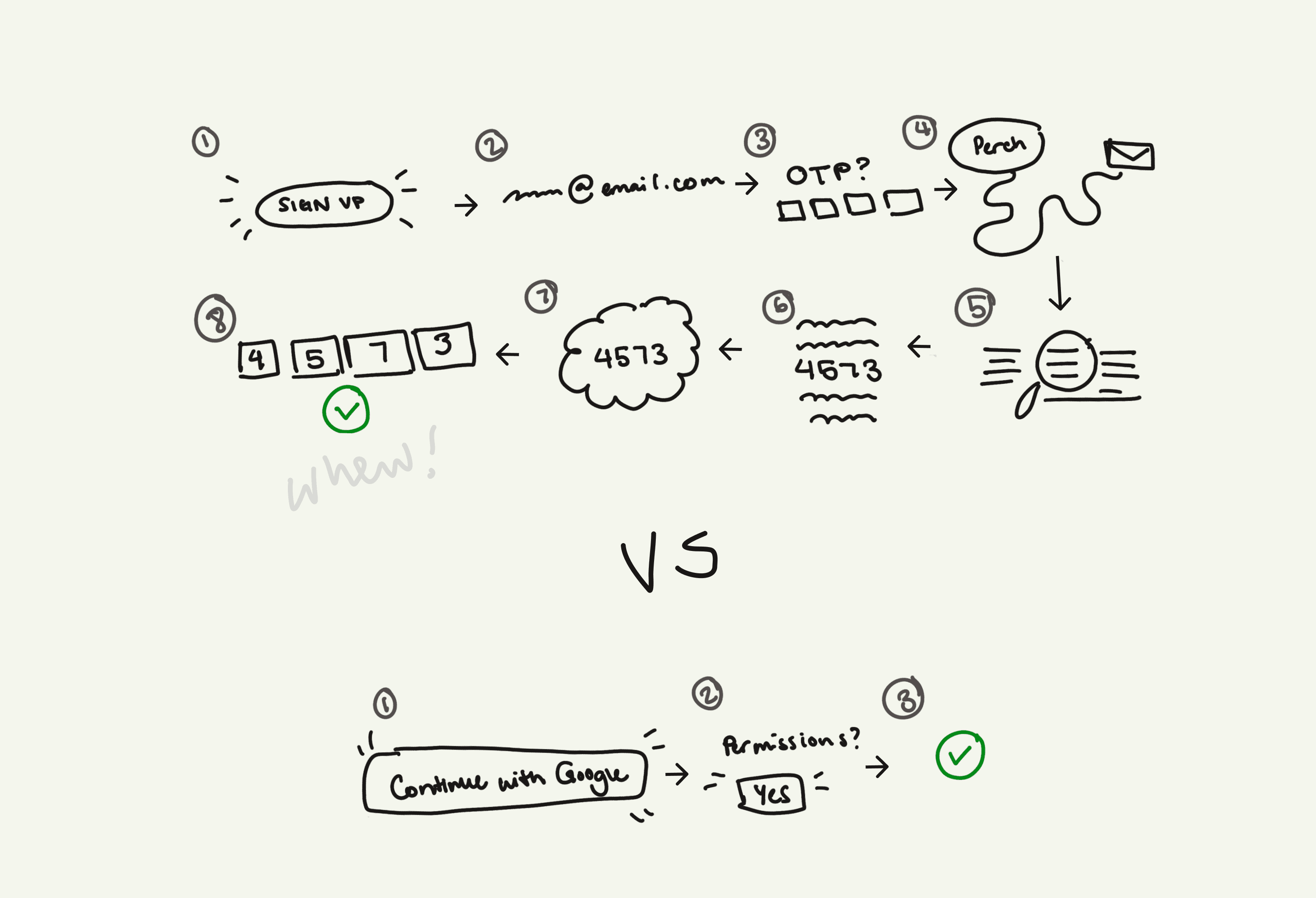
From Sign up to Verification, the user has to complete 8 steps vs only 3 with the Magic Link (Connect with Google/Apple)
Google and Apple sign-in transforms the process into a single tap, while keeping people in the app.
Why not phone verification? I thought about this a lot.
While phone verification offers simplicity, through magic-link, email offers that same level of simplicity and aligns better with Perch's core value: "All your blogs and newsletters in one place." By connecting through one-step email, Perch gets instant personalization from existing subscriptions, plus a direct line for sending unified updates, creating immediate value.
All this being said, do I think it's something worth AB Testing? Absolutely.

Connecting with Google keeps the user in the app and makes signing up feel much quicker
Tailoring the Experience
Tailoring the Experience
Personalization isn't just about what users read—it's about how they read it. From content discovery to reading preferences, every aspect should feel tailored to the user.
Personalization isn't just about what users read—it's about how they read it. From content discovery to reading preferences, every aspect should feel tailored to the user.
When users connect their email, I created a moment for Perch to immediately demonstrate value by identifying their newsletter subscriptions and offering one-click inbox decluttering.
Previously these publications were quietly added. Now, we can showcase this capability as a 'hero moment' before formal onboarding begins. This builds trust and shows how Perch simultaneously streamlines their reading experience and personalizes content.
The personalization extends naturally through every interaction: topic interests emerge from existing subscriptions, content suggestions flow from actual engagement, and reading preferences surface when users need them. I designed a seamless way to connect social accounts so Perch can find others they already follow elsewhere, letting them instantly follow those same voices here.
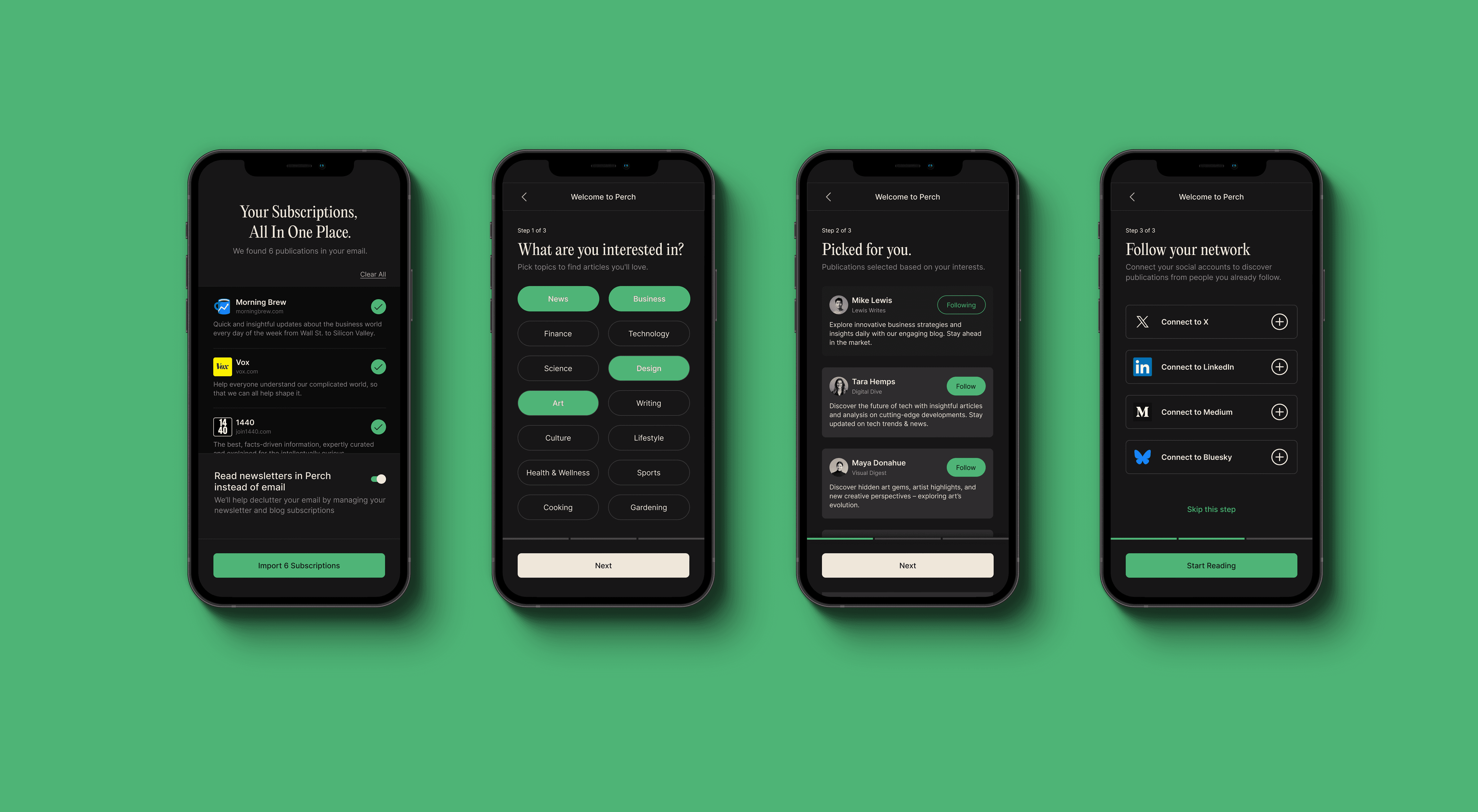
Moving publications from a user's email to the app after connecting. If any are imported, those are used to pre-select interests, or the user can select themselves. Those interests are then used to suggest some people or publication's to follow. Finally, a user has the option of connecting social media to find people and newsletters they already follow.
Reading Comfort by Design
Reading Comfort by Design
While rebranding wasn't the focus of this sprint, I did tackle some crucial reading experience improvements.
Standard black and white might look clean, it's not ideal for long-form reading. Instead, I opted for warmer tones that reduce eye strain and make extended reading sessions comfortable. Accessibility in a reading app is vital—ensuring high contrast, line height, and a legible typeface.
But Serif or Sans Serif? What's the most ideal type size for people? What if you didn't need to pick?
Rather than decide, I made it customizable. When someone opens their first article, they can adjust everything to their liking and try using their phone's settings (light/dark mode, text size) as defaults it feels familiar immediately.
Reading personalization opens when the user selects their first article after signing up. Users can change their settings either now or later, noting the icon where they could find this setting.
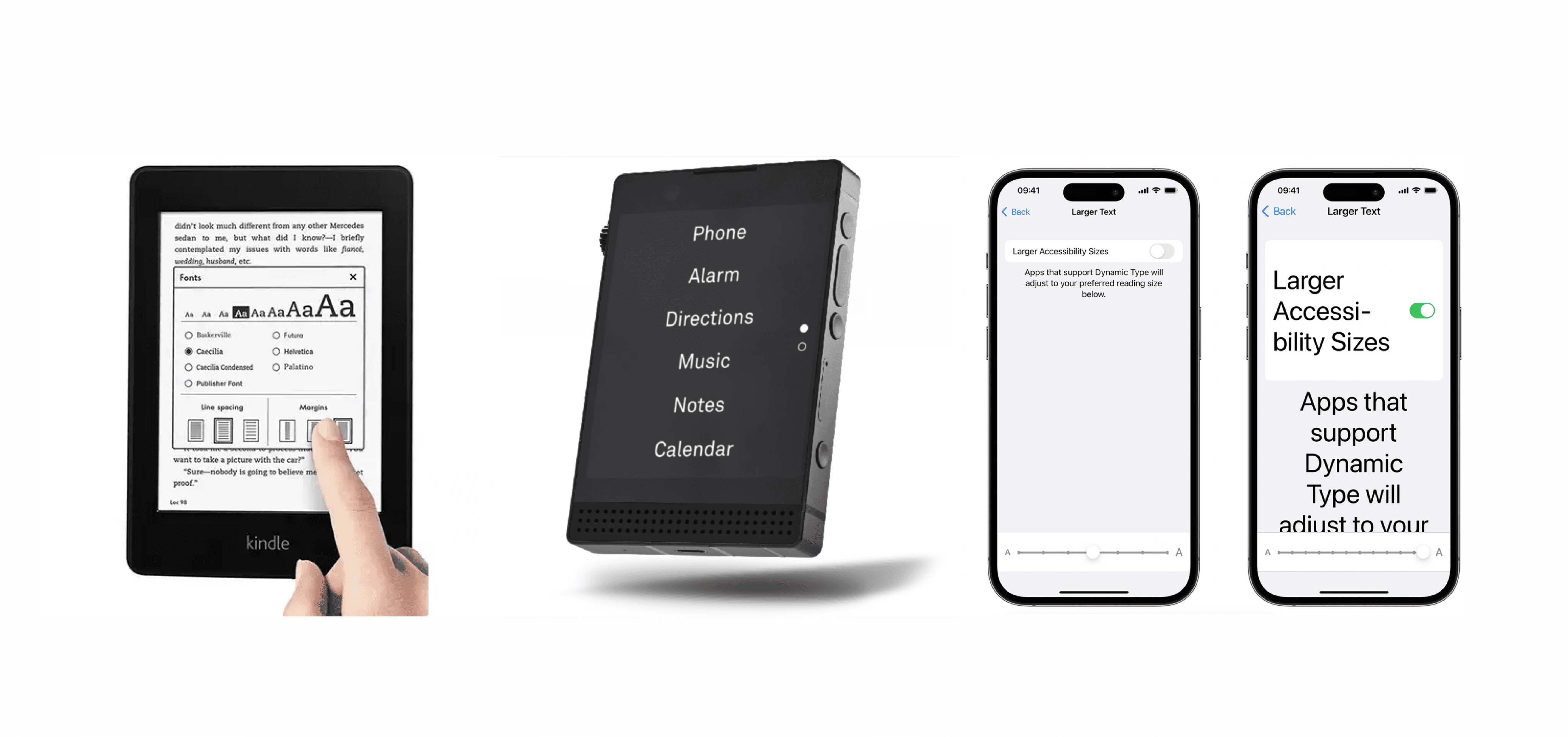
Some Inspo! Kindle, Light Phone, Iphone's settings
Brainstorming reading setting options
Go with the (User) Flow
Go with the (User) Flow
Every feature introduction aligns with natural behavior:
Browse freely, sign-up when you want to save something or engage further
Reading preferences appear through engagement
Recommended content and notifications surface when users need them
Following a writer or saving an article is important to enhance the experience at the right moment, rather than front-loading decisions
Final Flows
Final Flows
I transformed Perch's onboarding into an intuitive journey that proves its value from the first interaction. This case prioritizes delivering immediate value through smart email integration, followed by organic personalization that mirrors how people naturally discover content. Shows worth early, then deepens engagement through meaningful personalization.
I transformed Perch's onboarding into an intuitive journey that proves its value from the first interaction. This case prioritizes delivering immediate value through smart email integration, followed by organic personalization that mirrors how people naturally discover content. Shows worth early, then deepens engagement through meaningful personalization.
General Onboarding
General Onboarding

Notification Management
Notification Management

Reading Personalization
Reading Personalization

Next Steps
Next Steps
A/B testing phone-based magic-link signups vs. current flow
Setting up automated feed curation system that learns from early reading patterns
Implementing smart notifications that adapt to reading schedules
Developing reading goals to help users build sustainable habits
Creating collaborative features for shared reading lists and discussions
These improvements maintain the ethos behind the redesign: creating a reading space that feels personalized from the start and optimizes for what drives retention — a product that feels like it was made for you.